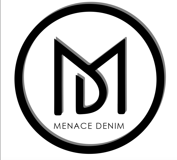
My design inspiration came from brands like Guess and Urban Outfitters because I love how simple and clean their logos are. I have always been inspired by the way you can see the triangle or question mark for Guess and the UO for Urban Outfitters and automatically know it is in representation of those brands. When designing my logo, I kept that in mind, as well as my target customer. Menace Denim is a brand committed to helping customers reduce their carbon footprint as well as waste by upcycling products that are unique and heighten confidence. I wanted my logo design to be a nice black logo to make it seamlessly show on anything customers want customized. I chose a 3D form design to make it pop out more and added a clean “Menace Denim” at the bottom because it is the brand name. Because my logo is black, I wanted it to be a contrast between that and the white background. I chose to interconnect the “m” and “d” because it is a direct representation of Menace Denim and even without the full brand name, the goal is to cause brand recognition for customers simply seeing those letters in that way. To create this logo, I started by creating a circle with the circle tool. Next, I used the pen tool to create the connected “MD” and played around until I was satisfied with the outcome. I then used the black selection tool to highlight all of my design elements, went to the effects tab, 3D and extrude bevel. Although I was happy with this, I felt like adding the brand name really sealed the deal.
After peer critiques I decided to keep my logo the same only because most of the recommendations involved changing the color from black and that was hard because of the 3-D effect. I really appreciate all of the suggestions given to me; I was just so happy with the design that I didn’t want to have to change it for the sake of color. I’m overall really satisfied with my logo and think it greatly represents a specific component of me, my up and coming brand.
